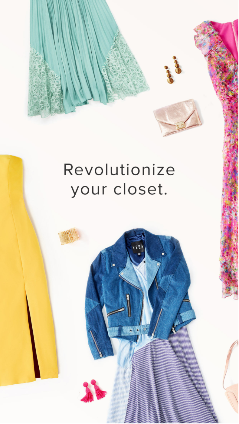
Rent the Runway
Rent the Runway is the smartest way to get dressed for special events or simply any day of the week.
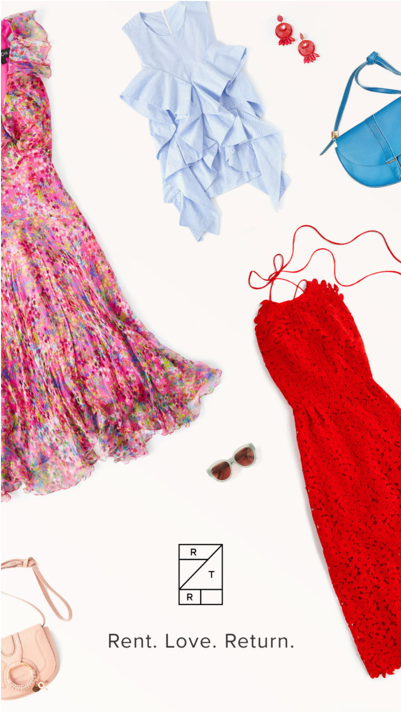
It’s a clothing-rental service backed by a monumental technology and logistics operation that democratizes fashion and lets women rent from thousands of designer dresses and accessories.
Rent the Runway combines fashion—the 3rd largest industry in the world—with the sharing economy—the most booming transaction trend of the 21st century—to make high-end, quality fashion more accessible and affordable to every woman in the US.
On top of that, Rent the Runway is creating a drastically more sustainable model to consume clothing in the sea of fast-fashion knockoffs, child labor and waste.
Rent the Runway is helping professional women offset the tremendous costs of business-casual attire that further the gender pay gap due to the unreasonable demands set on a woman’s appearance.
As a mid-size startup focused on experimentation, learning and aggressive iteration, Rent the Runway gave me the absolute freedom to evolve in every which way I wanted to—personally and professionally.
I took this opportunity to explore roles other than just programming.
![]()
![]()
I made mockups and prototypes. I conducted user research in person and online. I analyzed user feedback and funnel metrics to make better-informed decisions about our mobile strategy.
![]()
![]()
![]()
And ultimately, in 2017, I moved on to Product Management for mobile where I was able to combine all of these skills into one holistic role to drive our product vision.
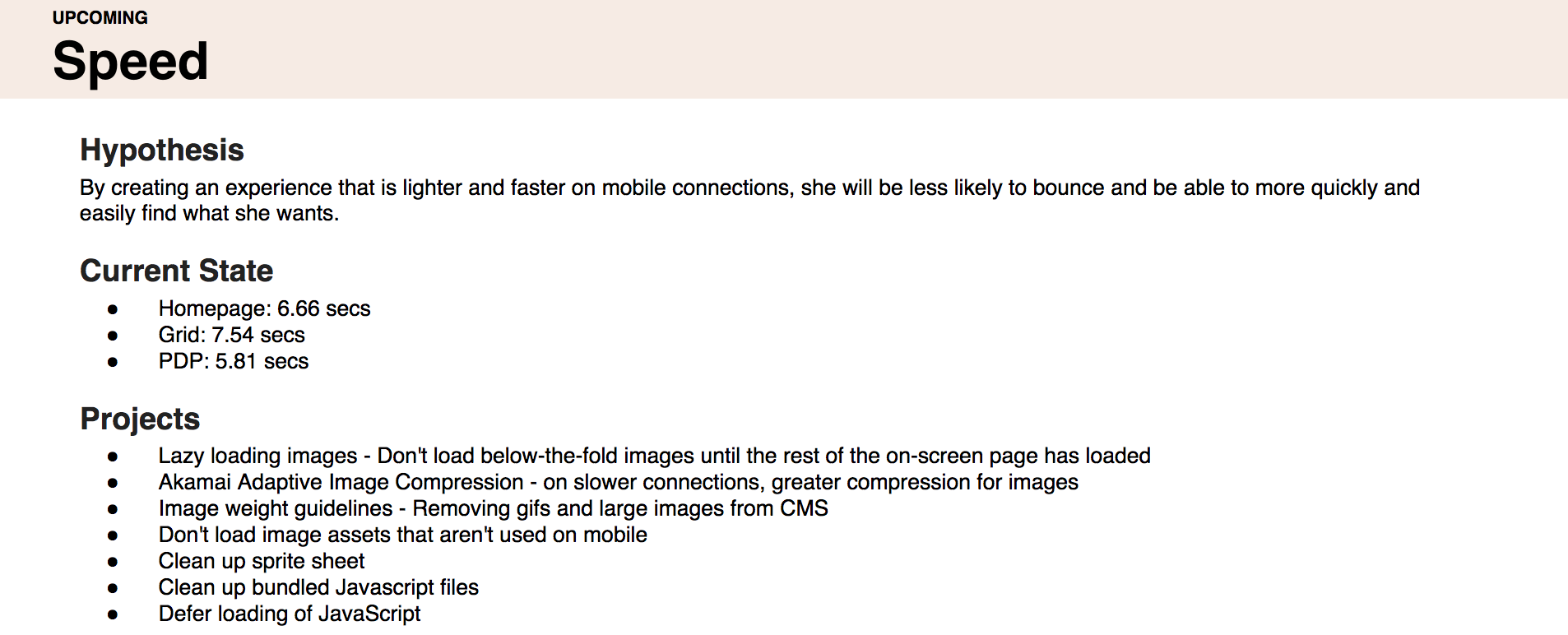
Everyone Deserves a Cinderella Experience
Because of the fast-growing importance of the iOS app to our business, it was easy to see the direct impact my work had for our company and our users, which was absolutely addicting.
Below, I’ve highlighted some of my personal and professional milestones at Rent the Runway.
I only had to swap out icons and colors, but these changes touched every single screen in the app, so the task had an insane learning curve. It was the best introduction to the codebase I could have asked for.
Old version:
![]()
![]()
![]()
Rebranded version:
![]()
![]()
![]()
It’s a clothing-rental service backed by a monumental technology and logistics operation that democratizes fashion and lets women rent from thousands of designer dresses and accessories.
Rent the Runway combines fashion—the 3rd largest industry in the world—with the sharing economy—the most booming transaction trend of the 21st century—to make high-end, quality fashion more accessible and affordable to every woman in the US.
On top of that, Rent the Runway is creating a drastically more sustainable model to consume clothing in the sea of fast-fashion knockoffs, child labor and waste.
Rent the Runway is helping professional women offset the tremendous costs of business-casual attire that further the gender pay gap due to the unreasonable demands set on a woman’s appearance.
In a Nutshell
I joined Rent the Runway in August 2015, as an iOS engineer.As a mid-size startup focused on experimentation, learning and aggressive iteration, Rent the Runway gave me the absolute freedom to evolve in every which way I wanted to—personally and professionally.
I took this opportunity to explore roles other than just programming.
I made mockups and prototypes. I conducted user research in person and online. I analyzed user feedback and funnel metrics to make better-informed decisions about our mobile strategy.

And ultimately, in 2017, I moved on to Product Management for mobile where I was able to combine all of these skills into one holistic role to drive our product vision.
Everyone Deserves a Cinderella Experience
Because of the fast-growing importance of the iOS app to our business, it was easy to see the direct impact my work had for our company and our users, which was absolutely addicting.
Seeing your work positively impact the lives of so many women and hearing their stories makes working at Rent the Runway truly worthwhile.
Below, I’ve highlighted some of my personal and professional milestones at Rent the Runway.
2015, Rebrand
As soon as I joined, I was asked to own the Closet in the Cloud rebrand release that was supposed to go out in the next two weeks.I only had to swap out icons and colors, but these changes touched every single screen in the app, so the task had an insane learning curve. It was the best introduction to the codebase I could have asked for.
Old version:

Rebranded version:

2015, Usability in Practice
By being the newest member of the team—therefore the least familiar with the app and the service—I was able to see the app with fresh eyes and be critical of the user experience. One of the most egregious things I found flaws with was text field validation.So I decided to fix it, by giving our users correctly formatted placeholders, formatting the text as they type (especially numbers) to appear as it does in the real world, by helping recover from errors with clear and specific error messages and pointing out exactly what the problematic text fields were.
The change wasn’t dramatic, but by giving our users relevant error messages and feedback, we saved them many headaches and increased our conversion by 4.3%.
It conveniently coincided with RTRs annual HackWeek, so I immediately jumped at the chance to play with it and created TVGunn—à la Tim Gunn.
We wanted to introduce wireless technology to our retail locations, to help customers browse the retail selections through the app on location.
We strategically placed iBeacons in the store that detected whether the customer had the RTR iPhone app.
If the customer had the app, the Apple TV immediately showed their saved lists of outfits.
Our goal was to streamline, personalize and enhance the in-store experience.
![]()
I wrote a blog post about the experience here.
2015, Shipping Swift
Swift celebrated its first birthday 2 months before I joined Rent the Runway. Although the language showed a lot of promise, app developers were wary of putting it in production.
But, in early November I decided to build two informational landing pages in Swift and introduced the first Swift production code to our app!
![]()
![]()
![]()
Working on this feature I learned some important engineering lessons:
2015, HackWeek and Apple TV
In September 2015 Apple introduced an AppStore specifically for the Apple TV.It conveniently coincided with RTRs annual HackWeek, so I immediately jumped at the chance to play with it and created TVGunn—à la Tim Gunn.
We wanted to introduce wireless technology to our retail locations, to help customers browse the retail selections through the app on location.
We strategically placed iBeacons in the store that detected whether the customer had the RTR iPhone app.
If the customer had the app, the Apple TV immediately showed their saved lists of outfits.
Our goal was to streamline, personalize and enhance the in-store experience.
I wrote a blog post about the experience here.
2015, Shipping Swift
Swift celebrated its first birthday 2 months before I joined Rent the Runway. Although the language showed a lot of promise, app developers were wary of putting it in production.- The language was still new and rapidly evolving.
- Things that might work one day, could break the next day.
- The interoperability between Objective-C and Swift was not as smooth as Apple lead us to believe.
But, in early November I decided to build two informational landing pages in Swift and introduced the first Swift production code to our app!

Working on this feature I learned some important engineering lessons:
- Backwards API compatibility is important for mobile apps where you can’t force users to upgrade—think ahead.
- New and shiny == unexplored and surprising. You will encounter hiccups that don’t make sense.
- It’s important to make sure that the frameworks you’re using work on all of the OS versions your software is supposed to support. For example, don’t use Stack Views for iOS8.
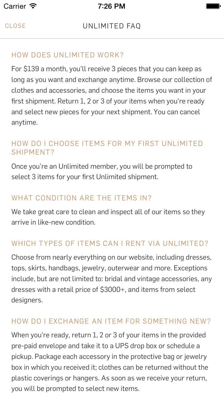
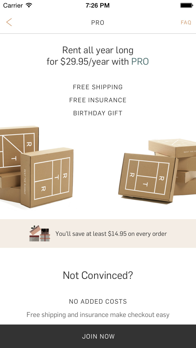
2016, Unlimited
The biggest launch at Rent the Runway since the company started was Unlimited—our monthly subscription program.
Women pay $159/month to have access to 4 items on-rotation that they can swap out at any time.
When I joined, Unlimited didn’t exist on the app, except for this purely informational screen.
Women pay $159/month to have access to 4 items on-rotation that they can swap out at any time.
When I joined, Unlimited didn’t exist on the app, except for this purely informational screen.
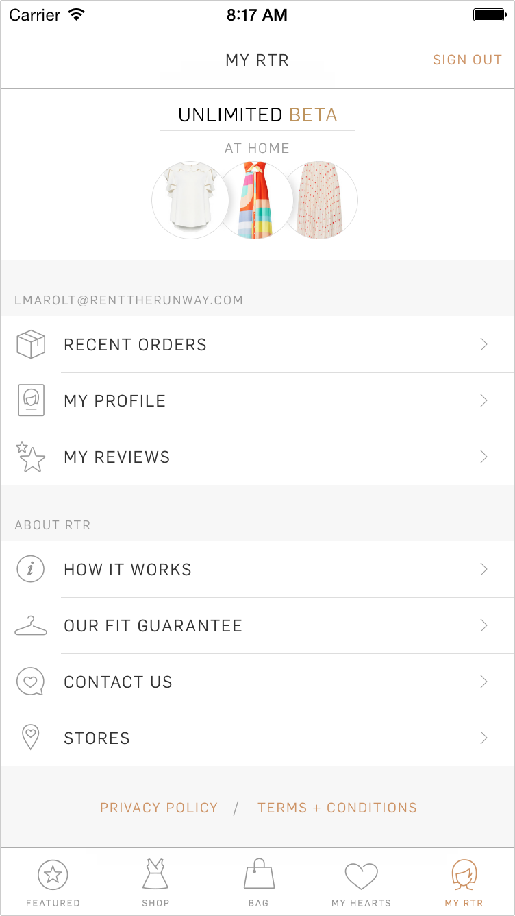
I designed and implemented the main entry point for a user’s interaction with their Unlimited subscription—the Unlimited Dashboard.
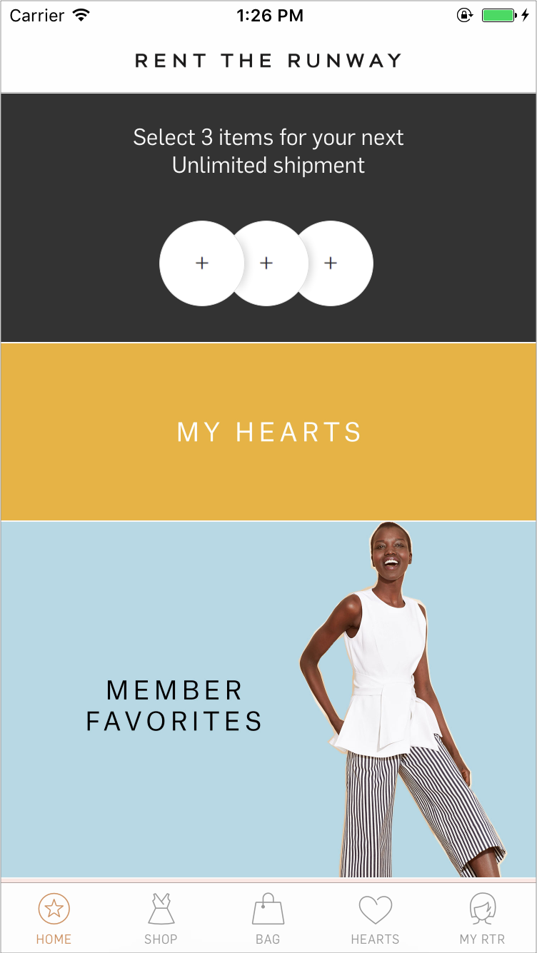
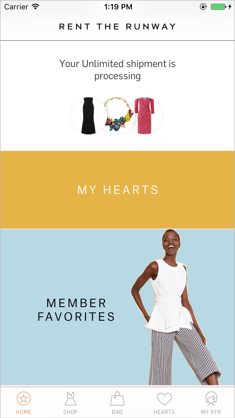
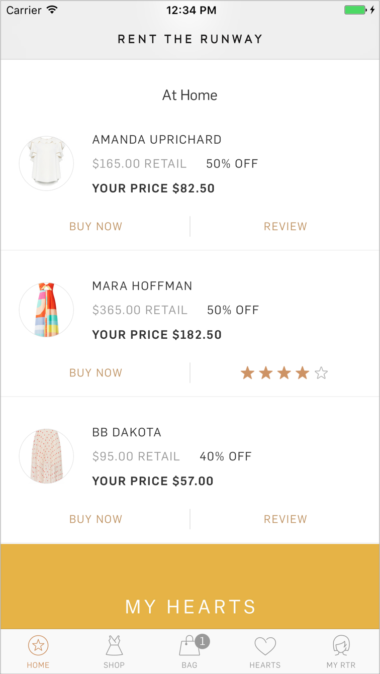
Here, users could see how many items they can pick, how many they have at home, and how many are on their way. They could monitor their order status, submit reviews and buy the items if they wanted to keep them.
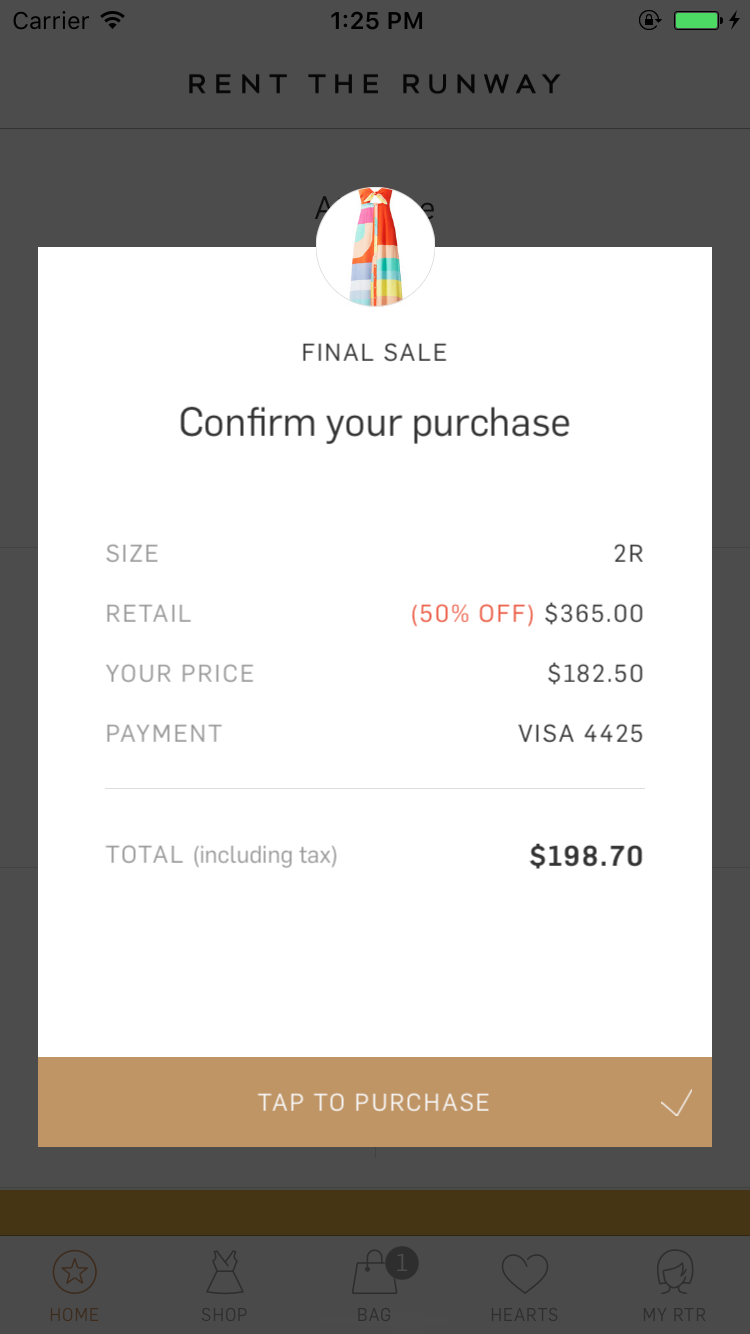
During user testing, we saw users accidentally tapping the TAP TO PURCHASE button.
They were surprised and confused when the app suddenly informed them of their successful—and expensive— purchase.
Even when they tapped the button purposefully, they were surprised and a little uncomfortable by how quick the transaction occurred.
They were surprised and confused when the app suddenly informed them of their successful—and expensive— purchase.
Even when they tapped the button purposefully, they were surprised and a little uncomfortable by how quick the transaction occurred.
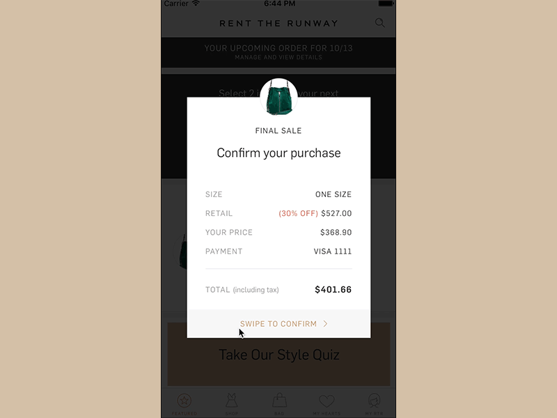
To mitigate this issue, I proposed, designed and implemented a Swipe-To-Tap control that would require a little more effort on the user’s part, but would definitely make sure that the action was intentional.
![]()
2016, Deeplinking
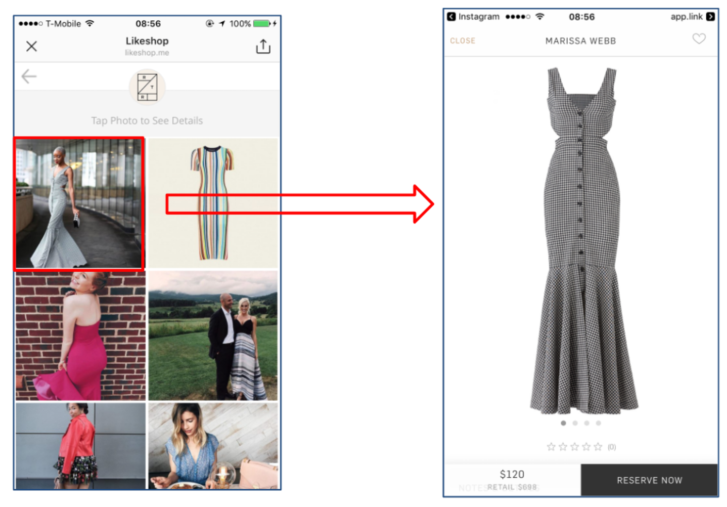
One of the biggest achievements of my RTR career has been Deeplinking—in all its shapes and sizes. It all boils down to this:
Placing the user on the device and service that can best suit their present need.
It all started back in February 2016 and continued sporadically improving throughout the year. In the end, I implemented a pretty robust, flexible and scalable deeplinking architecture that mimicked the structure of URLs. This allowed us to render any screen on the app through a simple deeplink through any website link, Instagram post, tweet, email or text message.
This feature opened the gate for our marketing team to run app campaigns for the first time and later allowed us to easily support Universal Links and an integration with Branch.


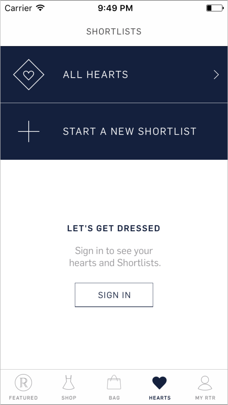
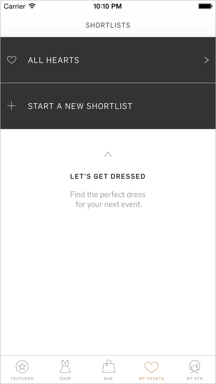
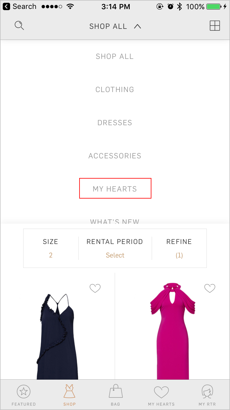
2017, Hearts and Shortlists
This was my first project as a Product Manager!
In late 2016, we realized that one of our most neglected features was also one that our customers loved to use.
Since RTR has amassed over 8,000 pieces of clothing and accessories, you can imagine that sorting through that entire inventory is a daunting task—to say the least.
That’s why when our users see something they like, they Heart it or put it in a Shortlist, to save and find again at a later time.
![]()
In late 2016, we realized that one of our most neglected features was also one that our customers loved to use.
Since RTR has amassed over 8,000 pieces of clothing and accessories, you can imagine that sorting through that entire inventory is a daunting task—to say the least.
That’s why when our users see something they like, they Heart it or put it in a Shortlist, to save and find again at a later time.

The Problem(s):
- Users weren't able to refine their lists by date, size, or other filters
-
Unlimited users actually couldn't order items from their shortlists
- Old backend was returning inconsistent data
-
Users couldn't consistently edit and organize their shortlists
- Outdated branding and UI
- New users didn’t understand the feature or know how to use it to their advantage
Why was it worth it?
- 50% of converting sessions on the app included interactions with Hearts or Shortlists
-
Users with Hearts or Shortlists are more engaged, especially on the app
-
20% of app users visit the Hearts and Shortlists section
- 46% of shortlists are created in the app
- Hearts or Shortlists sessions were 3x better converting
We tackled these problems with clear goals in mind:
- Increase traffic to Hearts and Shortlists on the grid by 20%
-
Drive 15% more users to create Shortlists in app
-
Increase Hearts and Shortlists CVR in the app by 15%
- Drive 20% more Unlimited orders to be picked from Shortlists
So, what did we do...
Improved Functionality:
Users can now see and rent from their individual Shortlists directly from the main navigation (don’t always have to go to the special Hearts tab anymore), where they can search by date, size and apply any filters they want.
Unlimited users can now actually select items from their shortlists. Biggest App Feedback request after the membership was introduced!
When users add items to their shortlists, they can preview the last two items in their shortlist for easier recollection through an improved picker UI.
![]()
![]()
![]()
![]()
Users can now see and rent from their individual Shortlists directly from the main navigation (don’t always have to go to the special Hearts tab anymore), where they can search by date, size and apply any filters they want.
Unlimited users can now actually select items from their shortlists. Biggest App Feedback request after the membership was introduced!
When users add items to their shortlists, they can preview the last two items in their shortlist for easier recollection through an improved picker UI.


Shortlist Tab UI/UX:
Pushed the Shortlist UI to the modern era, and made it easier to edit, share and organize shortlists.
Imposed a Smart Rank to how Shortlists are sorted. The Shortlists that take priority are the ones with the closest event dates or the ones you’ve most recently interacted with.
Improve the recommendations selection UI by letting users tap or swipe through the products and adding an undo button to go back a step in case they made a mistake.
![]()
![]()
![]()
Pushed the Shortlist UI to the modern era, and made it easier to edit, share and organize shortlists.
Imposed a Smart Rank to how Shortlists are sorted. The Shortlists that take priority are the ones with the closest event dates or the ones you’ve most recently interacted with.
Improve the recommendations selection UI by letting users tap or swipe through the products and adding an undo button to go back a step in case they made a mistake.


Education:
Added an onboarding to the feature that shows up the first time a user hits those screens. This included explanations of the feature(s) and suggestions to recover from empty states. Like the end of a list, for example, or if the user has no hearts or if they have no Shortlists.
![]()
Added an onboarding to the feature that shows up the first time a user hits those screens. This included explanations of the feature(s) and suggestions to recover from empty states. Like the end of a list, for example, or if the user has no hearts or if they have no Shortlists.

And a little extra magic:
For phones that support it, we also added some light haptic feedback when the user taps on a heart to reinforce the positive interaction.
How did these changes perform?
For phones that support it, we also added some light haptic feedback when the user taps on a heart to reinforce the positive interaction.
How did these changes perform?
- Drove 27% increase in Unlimited order picked from Hearts and Shortlists
-
Increased traffic to Hearts and Shortlists for Unlimited users by 40%
-
Increased traffic to Hearts and Shortlists for rental users by 7%
- Shifted Shortlist creation to 56% in-app, by increasing raw numbers of Shortlists created by 60k, while keeping the web numbers flat
2017, Universal Linking and Connected Services
As our traffic shifted to around 64% mobile, and mobile was growing YOY at a very healthy pace, we were thrilled. However, most of that traffic was coming from the mobile site—the platform with the worst experience, and the smallest conversion—1.4%.On the other hand, we had a stellar mobile app where the users were heavily engaged, returning to the app 4-5x a month and converting at 6x the rate of the mobile site, but the traffic was entirely organic.
The path forward was obvious—we had to offer our mobile site users a better experience. And we could do that by shifting the mobile site traffic to the app by providing non-disruptive opportunites for our users to easily download the app, or open a particular screen on the app if they had already downloaded it.
Hypothesis:
If we evolve the mobile app and site together, learn from one another, synchronize key touch-points, and contextually place the customer on the platform that best serves her needs, we will grow traffic, orders and new customers on the mobile ecosystem.
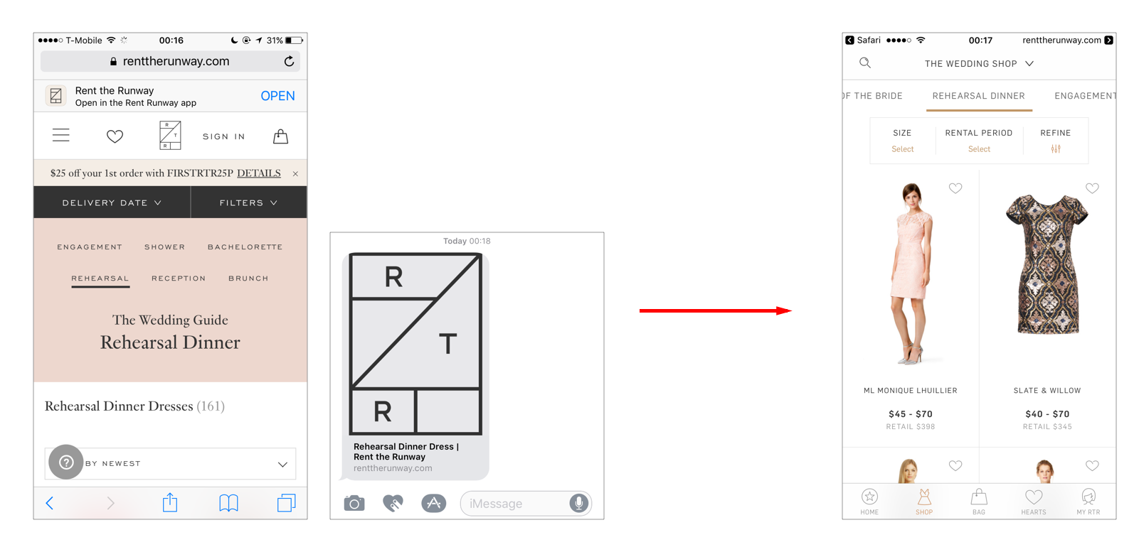


This could happen on the mobile site, emails, social media, text... we wanted to make it possible that anything that happened on your phone that had the potential to be opened in the app, could be opened in the app.
To do that we expanded our existing deeplinking architecture to also support Universal Linking. On top of that, we integrated Branch.io to create on-the-fly campaigns around the mobile app and to help us track the performance of our campaigns and placements.
![]()
Integrating Branch enabled us to have tracking on how, when and why users context-switch from email/social/text... to the app. It let us finally understand our user end to end, by connecting the dots of how our users behave on all of our platforms, which set the groundwork for the first paid marketing campaigns at RTR that target the mobile app.
This feature raised our app downloads by 33%, our email campaign conversion for users who had the app by over 200%, and our mobile app monthly traffic by 27% while keeping our conversion number on the app stable, even trending upwards over time.
![]()

Integrating Branch enabled us to have tracking on how, when and why users context-switch from email/social/text... to the app. It let us finally understand our user end to end, by connecting the dots of how our users behave on all of our platforms, which set the groundwork for the first paid marketing campaigns at RTR that target the mobile app.
This feature raised our app downloads by 33%, our email campaign conversion for users who had the app by over 200%, and our mobile app monthly traffic by 27% while keeping our conversion number on the app stable, even trending upwards over time.

2017, Mobile Site
In April I took over the mobile site as well as the mobile app, to better connect and evolve our entire mobile experience together.
Unfortunately, with the speed at which RTR was changing, the mobile site was more of an afterthought for a long time.
This meant there were many broken experiences to be fixed. I soon learned to think of these as opportunities rather than problems—through the expert mentorship of my new manager, Chris Gonzalez.
There was so much we could do to have a huge impact on our customer experience right of the bat!
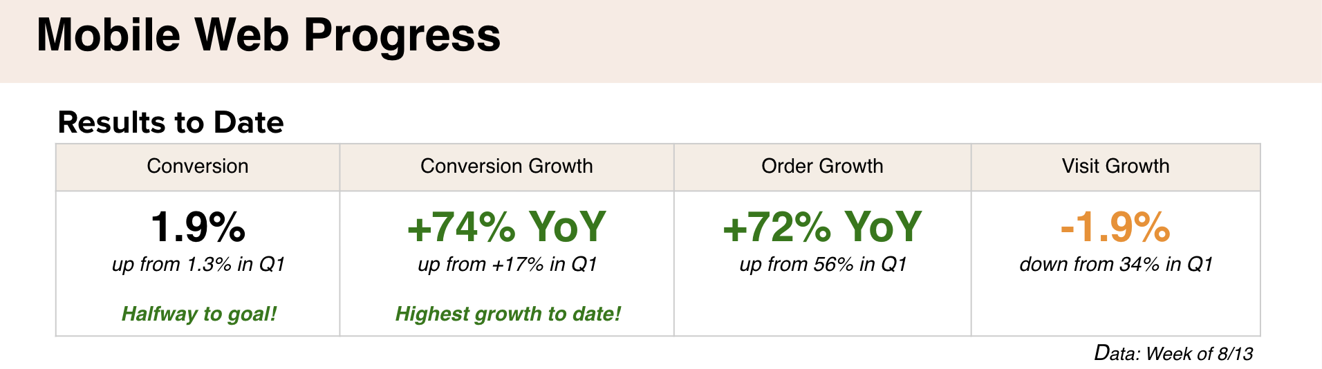
So we spent 3 months fixing broken experiences, and experimenting with different experiences and achieved amazing results.
![]() Some highlights and hypotheses:
Some highlights and hypotheses:
Can increasing the browsing real estate and showcasing more products improve the customer experience and in turn increase conversion?
![]()
Can simplifying and consolidating the navigation hierarchy make it easier for her to find what she needs and in turn lead to better engagement with the products?
![]()
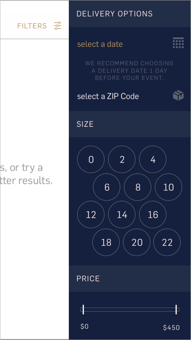
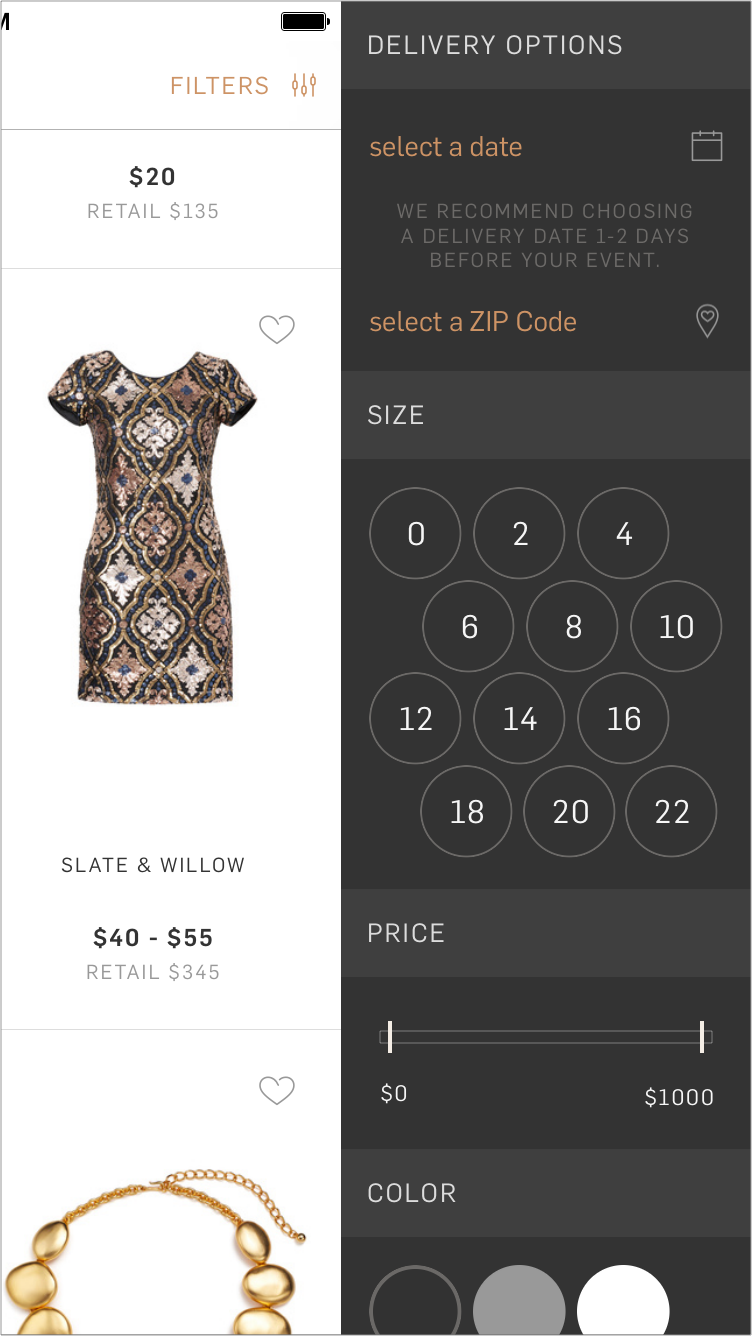
If we present filters modally and allow her to select multiple filters at once, instead of one by one, will we improve her browsing experience and help her find what she needs more efficiently, and in turn increase conversion?
![]()
If we show her all the benefits that come with an RTR rental, will that help ease her mind about renting a dress and make her more likely to rent?
![]()
If we include a zoom functionality on the product page, will that help her make the decision to reserve a rental?
![]()
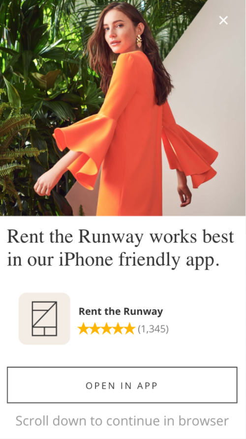
Will more women sign up for our service if we donćt block the entire screen with a login modal, but instead use a half screen modal, showing some (intriguing) content in the background?
![]()
This wasn’t even a question. We improved the speed of the site significantly, because we knew it would improve the browsing experience for our users.
![]()
Unfortunately, with the speed at which RTR was changing, the mobile site was more of an afterthought for a long time.
This meant there were many broken experiences to be fixed. I soon learned to think of these as opportunities rather than problems—through the expert mentorship of my new manager, Chris Gonzalez.
There was so much we could do to have a huge impact on our customer experience right of the bat!
So we spent 3 months fixing broken experiences, and experimenting with different experiences and achieved amazing results.
 Some highlights and hypotheses:
 Can increasing the browsing real estate and showcasing more products improve the customer experience and in turn increase conversion?

Can simplifying and consolidating the navigation hierarchy make it easier for her to find what she needs and in turn lead to better engagement with the products?

If we present filters modally and allow her to select multiple filters at once, instead of one by one, will we improve her browsing experience and help her find what she needs more efficiently, and in turn increase conversion?

If we show her all the benefits that come with an RTR rental, will that help ease her mind about renting a dress and make her more likely to rent?

If we include a zoom functionality on the product page, will that help her make the decision to reserve a rental?

Will more women sign up for our service if we donćt block the entire screen with a login modal, but instead use a half screen modal, showing some (intriguing) content in the background?
This wasn’t even a question. We improved the speed of the site significantly, because we knew it would improve the browsing experience for our users.
2017, Smart Components
As the needs of our marketing team grew, we made sure that most of our app copy was coming from our homegrown CMS (content management system). That meant that anyone could change the text in the app without having to release a new version.But the more users we had, and the more services we offered, the more we had to differentiate our brand and messaging based on user-specific attributes. For a while, we got by segmenting this copy, UI and UX on the client (app) side, but we knew the model would soon be unsustainable, so we had to think of another solution.
Smart Components are just that.

Smart Components are our in-house CMS architecture. They allow anyone to segment each piece of copy, imagery or UI definition based on very specific user attributes, simply by the client passing the userId to the backend when making the component request.
We can segment by the user’s memberships, the number of orders, whether it’s her birthday,... basically any data point we have on her.
The best part of all is that the benefits can be used across all of our platforms. The same Smart Component can dictate the content for the app, the website and the mobile site—particularly useful to ensure that we’re sending a coherent message and that we’re not doing repeated work.
Smart Components completely revolutionized how quickly and easily we can iterate, experiment and learn how to make a better experience for our users. It allowed marketers and product managers the freedom and independence to handle large-scale updates to site content simply by editing some JSON files, and not have to rely on engineers for every single little thing.
2017, Reviews
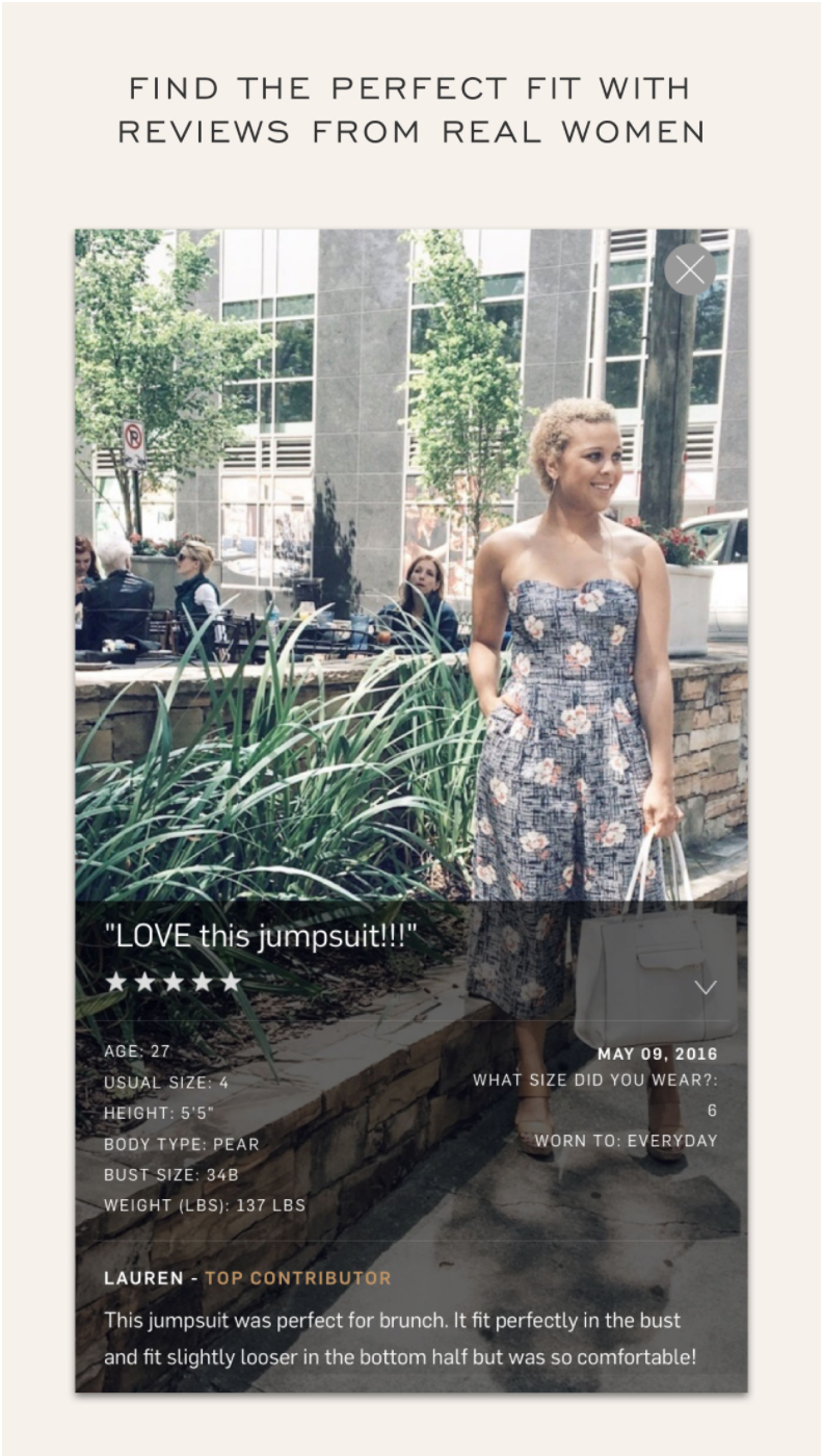
One of the best ways a woman can really understand how a dress will fit her is by seeing pictures of other women who look like her wear that same dress. That is why our reviews are one of the most important factors in deciding whether she will rent the dress or not.
Reviews help our users understand fit, and any potential quirks a dress might have to give them the confidence needed to rent a dress.
![]()
The reviews in the app were getting a little stale, so we decided to freshen things up a bit. We added the featured review photo as the last photo in the product images, we condensed the review rating in 3 bars that explained the product’s fit in a glance and put it on the product page, and we finally answered the prayers of so many users by introducing a review-sorting mechanism.
It now even allows sorting by Women Like Me, where the user can input her size, height and bust to sort the reviews by most or least similar to her measurements.
![]()
![]()
![]()
Reviews help our users understand fit, and any potential quirks a dress might have to give them the confidence needed to rent a dress.

The reviews in the app were getting a little stale, so we decided to freshen things up a bit. We added the featured review photo as the last photo in the product images, we condensed the review rating in 3 bars that explained the product’s fit in a glance and put it on the product page, and we finally answered the prayers of so many users by introducing a review-sorting mechanism.
It now even allows sorting by Women Like Me, where the user can input her size, height and bust to sort the reviews by most or least similar to her measurements.


2017, Control Center
Opportunity: On average, the app gets ~150k browsers, and ~120k clicks on the homepage content in a week (both non-unique).
From numerous user tests we’ve conducted for the app, in-person and on usertesting.com, we have empirical evidence that shows users engage with the homepage when they:
However, the current experience is bland and uniform. Customers have complained that it doesn’t change quickly enough (only 2x per month) for them to keep checking for updates. Therefore, the goal of this project is to create interactive, shoppable modules that address utility, education, inspiration and discovery with more flexibility to create applicable marketing content.
![]()
![]()
![]()
And so, the Control Center project came to be.
Hypothesis: If we create a flexible, personalized, non-stale and easy-to-use homepage with a focus on quick & easy product discovery and access to the most important parts of the RTR service, our customers will be better engaged, informed and more likely to return, which in turn will increase engagement, traffic, and conversion.
From numerous user tests we’ve conducted for the app, in-person and on usertesting.com, we have empirical evidence that shows users engage with the homepage when they:
- Need help navigating
-
Feel overwhelmed by the selection
-
Want inspiration for a specific event
However, the current experience is bland and uniform. Customers have complained that it doesn’t change quickly enough (only 2x per month) for them to keep checking for updates. Therefore, the goal of this project is to create interactive, shoppable modules that address utility, education, inspiration and discovery with more flexibility to create applicable marketing content.


And so, the Control Center project came to be.
Hypothesis: If we create a flexible, personalized, non-stale and easy-to-use homepage with a focus on quick & easy product discovery and access to the most important parts of the RTR service, our customers will be better engaged, informed and more likely to return, which in turn will increase engagement, traffic, and conversion.


This entire feature is controlled by the CMS and our Smart Components architecture and will soon transition to use our recommendation system built specifically for this use case:
Help her quickly find what she wants, and help her discover what she needs!
The end result was released to the public on September 10th and you can take a peek at it yourself by downloading our app here.


Note: If you’ve read all the way to down here you deserve a promo code, so feel free to shoot me an email to get one (: